This week’s guest designer is Amy Forshew from Pemberley Style. Amy blogs out of Pennsylvania, where she lives with her two adorable kids and a British husband. She owns a beautiful classic traditional home accessories online store, Pemberley Collections. I love Amy’s sense of humor and penchant for all things English. Please, help me welcome Amy Forshew to The Shiny Pebble Designer Challenge:
~~~
Background“I graduated from Marymount University in Arlington, VA with an undergraduate degree in Interior Design and a minor in Art History. While I was a student I worked for interior designer Camille Saum. At that time in my life I really clicked with politics and decided to make a career change. I worked for Congresswoman Sue Kelly of New York, specializing in healthcare law and legislation. I also worked as a lobbyist for R. Duffy Wall & Associates and then in the firm of Preston Gates Ellis Rouvels & Meads in their lobbying practice.
I retired from the fast paced life of Washington, DC after I had my first child. I started doing interior design for friends. Now that we have moved for the VERY LAST TIME (halfway across the US and back inside of 14 months, once with a toddler and 8 months pregnant, and then with a one year old and a toddler, but who remembers all that stuff anyway) I have my own retail business, Pemberley Collections and work with a few interior design clients.
I would have to say my specialty is window treatments and upholstery. There are a lot of wealthy folks around where I live, but I have to say that everyone loves a bargain and getting a fair deal. I know where the bargains are and who has the best prices on fabric.”
Here are Amy’s answers to a few of my questions:
The Shiny Pebble: How do you define your style?
Amy Forshew: My style is definitely traditional. I tend to go with very strong color choices at the moment. With that said some of the most beautiful rooms tend to be understated and monochromatic.
TSP: What inspires you?
AF: Design magazines, fabrics (I can spend hours in a fabric showroom), stately homes and style icons like Jackie Kennedy Onassis.
TSP: What designer or life experience has influenced your design aesthetics?
AF: I think growing up in a place steeped in Revolutionary War history has had an influence. I’m from New Jersey (and I’ve heard all the jokes). Just down the road from the house I grew up in is a place called Knight’s Farm. Part of the original house dates back to 1675. The man who owned it in the 1770’s rented George Washington the boats which he used to cross the Delaware Christmas Eve. I think that’s really neat. My husband is British so we spend a lot of time in UK, which must have an influence on me.
TSP: Where is your go to source?
AF: My go to source for fabric is Pindler & Pindler and Duralee, great quality and price points. For lighting I love Shades of Light. For furniture I always find something at Baker.
TSP: What were your thoughts for my room?
AF: I approached Catherine’s dining room the way I approach any client – I listened to what she was saying and I looked at the rest of her house. Catherine wants to make her dining room more ‘hip,’ which I can do. The trick is creating a space that relates to the rest of the house which is more traditional. I think this is always a good practice, especially for Catherine’s home since the floor plan is more open and flowing.
Let’s start with the back wall, the one with the china cabinet.

The first thing I noticed are the bump-outs on either side. Bearing in mind that I have never set foot in her house, I’m betting that the builder did that to conceal the HVAC ducts. It gives you more square footage yes, but it can be awkward. I propose getting a guy in there to trim them out and make them look like square column or pillars. It might be tricky with the top of that door trim, but a good trim guy can do anything.
Then I would cover that back wall with grass cloth wall paper in a neutral color. I think the grass cloth is both hip and classic at the same time like Tom Ford.
I’m going to paint the whole room Farrow and Ball Cat’s Paw (240) which will make all that trim pop. There is so much light in that room that it can take a lot more color.
I would edit those accessories on the top of the hutch. We need to fill the space on either side with a bit more art work. Keep the landscape theme, stick with a classic frame very similar, but not too matchy.
Around to the right is the buffet. Keep that and the mirror. Don’t get rid of all your furniture unless it was something your husband bought before you were married and he picked it out with an old girlfriend. Catherine needs new lamps, specifically buffet lamps which are tall and thin to shed light on the food and don’t take up much room.
Now I’m going to steal a trick from Barry Dixon and accessorize with apothecary jars filled with colored water. Change the water with the season or fill with shells, small ornaments or sea glass.
Next I’m going to pop out of the dining room and into the foyer.
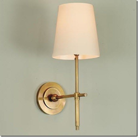
I’m going to put grass cloth in the inset and call the electrician. I think sconces would look lovely as long as we can put a halogen down light in the ceiling that can light up the art work. The sconces will make a deep shadow. The grass cloth will mirror the wall opposite and tie the rooms and feel together.
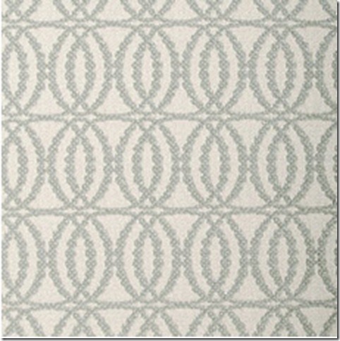
We can reupholster that bench with about a yard and a half of fabric so let’s keep it. I propose covering it in this:

Across from the buffet are two fabulous French doors. Now I think I can get a skinny rod over those doors, but again I have to be there with a step ladder and my measuring tape. I would take a solid silk fabric and make some drapery panels with a pinch pleat top. I’m going to match the fabric to the walls so it adds texture, dimension, and softness without being too distracting. It will also balance the room out with the buffet being directly across.
I love tape! I’m going to trim those panels with this:

If Catherine said no then I would at least paint the inset white, the same as the crown molding. It should be part of the ceiling and not a piece of the wall. I would beef up that crown molding as well.
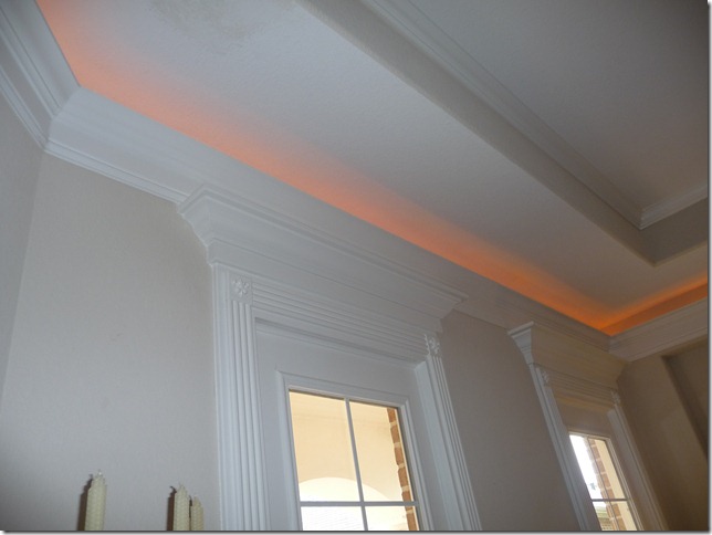
Then I would install this chandelier:
I would keep the table and the arm chairs and put those side chairs on Craigslist. I’m not really in love with the arm chairs, but she can easily switch them out down the road when her husband is out of town and not checking the AMEX bill for awhile.
For side chairs I’m partial to Parsons Chairs. They are a classic look that can lean contemporary or traditional, best of all they can be slip covered. In three years when you have a thing for stripes you can have new ones made.
I would go with these from Ballard Designs. They have the straight back with no roll. You can’t slip cover the ones with the roll. Ballard has a good price point and they are well made.
I would cover them in this with a tailored skirt:
And trim out the skirt with this:

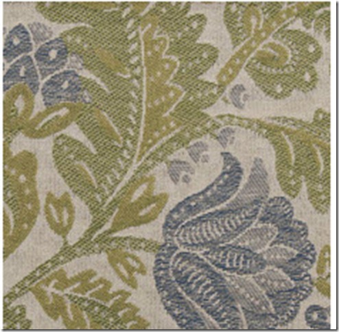
I think those arm chairs need a nice solid comfy chenille so I’m going to cover them in this:

I love this rug from Restoration Hardware and it won’t fight with the grass cloth wallpaper.

Now Catherine mentioned that she likes that big chair in the corner. We can leave that but it’s going to need a big hit of fabric against the draperies and walls otherwise it might disappear.
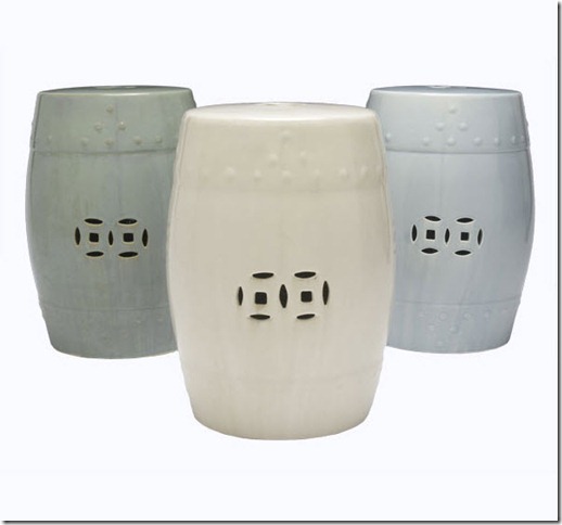
The table can go in another room. The rectangle doesn’t work in that corner. I think a little Chinese garden stool would work well and the motif repeats that circle shape again.
I hope you enjoyed the trip around the room and the explanation behind my choices. I think it’s important to listen to your client and to have a reason behind every choice, even if it’s ‘because I love it’.
~~~
Don't forget to stop by Splenderosa to see the outfit she has put together for this challenge
If you all enjoyed this makeover as much as I did and would love to see more entries and related posts, please check out the links below:Amanda Burdge's Creating a Hip Space from a Traditional Place
Raina Cox's (If The Lampshade Fits) Boho Contempo Style
Christina Fluegge’s (Greige) Transitional Eclectic Mix
Beth Connolly’s (Chinoiserie Chic) British Colonial Style
Once again, thank you The Daily Basics for helping us spread the word of the challenge.
Hugs and Kisses!
Catherine
Linking to: YooHoo Wednesday, Make it Yours Day, Whatever Goes Wednesday, Creative Share,Tablescape Thursday, Remodelaholic, Fabulous Nest Friday, Metamorphosis Monday









33 comments:
The design concept is lovely and works wonderfully well with the outfit I've chosen for you to wear when you entertain in this room for the 1st time. Have fun!!
Catherine this has been such an enjoyable series!! So fun to see each desgners take. Amy is really a great designer.I love the coffered ceiling idea!
Karena
Art by Karena
It sounds all too fabulous! I love the idea of the coffered ceiling and the chandelier!
♥ Daniëlle
Okay- so far this is my favorite- probably because she nailed what I would have done! LOL I LOVE beautiful millwork and think it adds immeasurably to a room- great job!!
xoxo Pattie
It's very inspiring to read what the designer was thinking about every detail. Makes one want to step back and take a second look at how we've decorated!
Wonderful inspiration, and I am so glad to see pot lights!! lol. I think those useful little guys don't receive enough credit.
Come check out my latest giveaway :)
Grass cloth, slipper chairs and coffered ceilings - swoon! With all these wonderful suggestions, how are you ever going to make up your mind?
This is my favorite so far....love everything she has got going for you. I love this fun game you have thought up...I look forward to every Wednesday
This is a great challenege, and I love what Amy proposes for your dining room. The lighting in particular is wonderful, as is that wonderful trim for the curtains.
I especially like the ceiling and walls. She really thought about the whole space!!
wow, i just felt i also had a sit down meeting with amy as she was going through her design concept...great style, simple, fresh and very pleasing! will check out her store and also visit splenderosa! great wednesdays party here! verbena cottage
like your concept board... looks very fresh and elegant at the same time... nice interview too!
Loved the grasscloth idea....We did that in Sand Springs to turn a former gun cabinet into chic shelving. Then on the oposite wall to make half the living area into a dining area next to the Baby Grand (which Christy has now). Tall and more slender lamps: YES!!! more romm for FOOD, glorious FOOD! Love the return to soft blues and greens. All Creation seems to favor MUCH green in the dry land of Earth and much blue in the Firmament and the Seas. What a calming combination with the warm neutrals in the walls and draperies. This is my favorite too!
Love the coffered ceiling! Maybe at the end of this Designer Challenge you could put a poll and let everyone vote on which design they like best for your dining room; of course the finally decision is yours.
The grass cloth and the sconces! These are my faves, but really everything is so fab...including that amazing necklace...my favorite of them all so far.
I really enjoyed reading the post!Thank you for another brilliant introduction. :-) The pallet is simply amazing, but, again, I am such a fan of seige greens and nuturals. Thank you for sharing all of it with me. :-) Have a beautiful day!
Where to begin ~ her suggestions, ideas, and colors are fabulous. I'm taking notes!
Jo
I, too, am obsessed with grasscloth. Want it in my master bedroom. I absolutely love all of her ideas....I wouldn't have thoguht of the trim work....but it would make a big difference. Love the color scheme/fabric selections!
love these ideas! Can't wait to see whats next. Thanks.
A lovely job-very soft and elegant with great attention to detail.
I really like the idea of the grass cloth. Can you come to Dallas?
Love the idea for the "fifth wall." And what a beautiful color palette. It all seems so doable!
I love guest interviews! Very intriguing and insightful. I can't even begin to explain how much I adore the styles and colors in the photos.
Rachael
Great post, I love all of the design ideas!
Thanks for sharing at My Backyard Eden!
I am a follower of Amy's blog & was surprised to learn that she is a grad of Marymount, where my sis-in-law obtained her degree in interior design, as well! I really love this design & think that it would be beautiful in your space!
I love these choices too. Even though individually they are not as 'trendy' as I was expecting, together they seem to pack quite a punch.
But, the tips about colored water and hitting the Amex card when hubby is out of town were definitely the highlights for me!!
Thanks everyone for the really nice comments. I will come to Dallas or Houston or wherever I'm invited! I never thought I would get to virtually 'meet' so many nice, fun and creative people when I started blogging. You're all really cool.
I love your all your design ideas here! Recently found a apothecary jar and just put some handmade soaps in it. I was thinking to post it on my blog one day. Enjoy reading your blog!
What a wonderfully detailed walk-through. I was leaning in close reading all of what she said.
There are so many talented designers out there and I think there have been a huge amount of fantastic suggestions for your dining room.
I look forward to sharing my thoughts next week. Though I am not a designer like everyone else, I have had fun searching for ideas for you.
Happy weekend!
xx Charlotta
I love that lamp! I have a link party that I would love if you participated! it is on saturdays www.iamonly1woman.blogspot.com
What a fantastic project! A truly neat metamorphosis.
It took 23 years to complete my most recent project. Come take a peek.
Your ideas will be so sweet! I love the blue fabric!! Thanks for linking up!
For the first time in 2 months, the kids are in bed on time, the husband is asleep and I have time bymyself to relax (instead of stress & instead of work) with my iPad and your blog, and what a joy it's been! I really enjoyed amys process she took us through on What she did for your dining room. What a beautiful, but casually elegant design she did! It's something I can really relate to. This is so fun .... Now that I have my "me" time, I'm off to go see more. Amys very talented though. Really enjoyed this :)
Post a Comment