Thursday, May 27, 2010

The Art of Decorative Painting

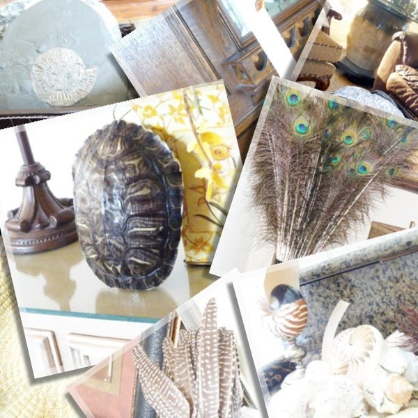
In the spirit of celebrating everything that is Art, I would love to introduce you to Ann Onusko of All things paint an plaster.  Ann is one of those lovely ladies whose touch transforms mundane things into beautiful art - be it an unloved piece of furniture or a patch of dirt.  I stumbled upon her blog a few weeks back and just fell in love with the fact that all of her posts clearly reflect who she is and what she loves.  The blog is written from a gardener/faux finisher point of view.  You will see images that seem to be unrelated and at the same time define an idea behind her creation (see here and here).  It is a fantastic opportunity for people like myself who are in awe of what goes on in an Artist’s mind.  For the interior designers in the bunch, as well as architecture buffs, I guarantee you all will enjoy spending hours perusing her posts looking at a wall, a piece of furniture, a pediment thru the eyes of an artist. 
~~~
AO's_up-doo_7-7-09
Ann Onusko  
Background

I am the second oldest of sixteen children and was raised in a very loving, active environment. As one of many children, I had to learn very young to speak up and be direct if you wanted to be heard at all! Consequently, I am a rather straightforward person, although I admire those who can wax poetic, as the saying goes.

After graduating with a BSRN degree from St. Louis University, I worked as a home care RN on and off for ten years while I was beginning to raise my three children.  I fell in love with gardening during the times I was home with my children and spent their nap time hours outside tending the flowers and vegetables. Eventually I began drying the flowers and creating arrangements and wreaths. I went to work in a flower shop and moved on to working for a special events decorator who opened up a whole new world for me. As the need for creating props increased, I began to study faux finishes and decorative painting all over the country. I couldn’t get enough! I now plaster and paint with my own company, Great Lakes Decorative Arts Studio and do freelance container gardening and other special projects.

My blog is All things paint and plaster….

The Shiny Pebble:  How do you define your style?
In my home, eclectic and European. In my dress, more traditional, although it is hard to say as I am usually dressed down for painting and gardening.  In my beliefs, rather liberal.

TSP:  What inspires you?
Excellent design, others with a passion for what they do and love, creativity, colors, textures and scents.

TSP:  What designer or life experience has influenced your design aesthetics?
In the painting world, Raphael and Michaelangelo.  In the modern times, I love Mark Rothko and Marcia Meyers. There are so many “unknown” painters in our contemporary world who I have met through online forums and conventions, and I have the utmost respect for them.

In the design world, I very much admire John Saladino and Axel Vervoordt.
As far as gardening and flowers go, I was inspired by two books: Earth on Her Hands and The American Woman’s Garden. Both demonstrated to me that a woman can do anything she sets her mind to do.

TSP:  Where is your go to source?
Books: from one of the best libraries in the country, the Cleveland Public Library in downtown Cleveland. It has a huge Arts and Garden section and it is very rare not find what I am looking for there. Of course, magazines and the internet also.

These sources allow me to find the professional painting products and flower and herb vendors with the most unusual offerings. I prefer to do what others are not doing!

My decorative painting projects range from lots of furniture finishes and cabinet re-dos to custom commercial applications, such as two large Art Deco screens, office and studio backdrops and finishes and two Italian domes with eight columns (see it here). While I enjoy most types of finishes, I prefer the more modern, contemporary finish. Gilding is also a favorite.

When working with a client, the key is to discover exactly what they are looking for. Often, they are not able to actually define that, but through visuals, such as photos, samples, botanicals, etc., we determine together which direction I should take. I will then create samples until we nail down the finish. It is very much a road to travel together. And, of course, changes often need to be made as I am working on site.

This first photo is a replication of a 1924 Art Deco screen by Edgar Brandt:
Brandt_Art_Deco_Screen_5-09_web2
Here are a few before and after photos of various projects:
This gold painted and peeling mirror was re-finished to coordinate with the client’s more contemporary décor:
Granziermirorafter4web-1
This hutch went from a 1960’s paint finish to a French gray:
Nicholshutchafterweb-1
This fireplace was in need of major repair, so the client decided to lighten the look and remove the gray overtones:
Reeffireplaceafter2web-1-1
The cement floor in this studio was awful, as you can see. I repaired and refinished it with water-based products that will stand up to the abuse that it will receive. It lightened the whole area:
PBSfloorfinalweb-1
This office had been painted a lime green that needed updating. It is now a shimmery, off white metallic that can be scrubbed and is accented with an eggplant gray:
PBSofficeafterweb-1
Last, but not least, this is my French Indochine finish. It was inspired by a client’s Pierre Frey pillow that she wanted to use in her powder room. I have done it two ways: the middle photo shows a topaz Venetian plaster background with a shimmery orchid metallic used to fill in the Chinoiserie design. The far right photo shows a different shimmery amethyst background with a topaz Venetian plaster filling in the design:


Thank you, Catherine, for this opportunity to explain a little of what a decorative painter does!

~~~

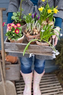
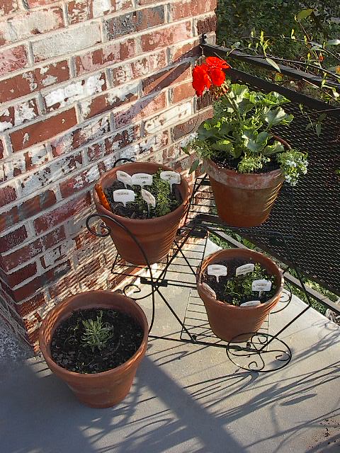
I absolutely adore her French Indochine work and would love to have a whole room covered in this finish!  And now, because I am so jealous of her green thumb, I will leave you with a few fabulous garden pictures from Ann’s bountiful Eden…
Spring_in_Bay_web
Spring_peony_almost_open_web
Garden_1_web_

Wednesday, May 26, 2010

Welcome Leigha Oaks

Leigha Oaks from Elle Oh


This week at The Shiny Pebble Designer Challenge we are welcoming to the designer corner of the blogosphere, Leigha Oaks from Elle Oh.  Leigha is a recent member of the blogging community and her blog home is a lovely sight to see.  She brings to the neighborhood the warmth and fragrant beauty of a sea breeze in the afternoon.  It must be a result of her five year sojourn in  Hawaii?  Either way, I am sure you are going to love her.

~~~
Background:
My formal education is a Bachelor’s Degree of Fine Arts in Interior Design, with a value and regard for endless education. I am an Allied Member of ASID {American Society of Interior Designers} and a LEED AP {Leadership in Energy and Environmental Design Accredited Professional}. I believe the world we inhabit is as important as the spaces we live in; keep both clean, sustainable, and beautiful.

I got my start in the industry working for a general contractor doing high end residential design. Then I moved on to a custom furniture and import company that also did high end residential design. Most recently, I worked at one of the largest hospitality and resort architecture and design firms in Hawaii.

How do you define your style?
My taste swings wildly from industrial and rustic to lavish and glamorous. I love interiors with enough tension and contrast to be interesting and enough charm and cohesion to be appealing. Combining unexpected textures and distinctive pieces makes me swoon.

What inspires you?
Nature. Geography. Elements. Vintage. Sustainable. Salty water (and all the salty creatures that live in it).

What designer or life experience has influenced your design aesthetics?
My design aesthetic parallels the places I have dwelled and the captivating cultures that come with each location, all of which have deeply influenced my designs.

Where is your go to resource?
Antique stores and, of course, the world of design blogs.

What were your thoughts on designing my room?
When Catherine offered me design freedom on a silver platter, I accepted with utter glee. The design concept is based on my personal aesthetic and current obsessions, though I did embellish the design with some of Catherine’s favorite things.

Disclaimer: Catherine, you will notice that I have replaced your furniture, starting with a clean slate. While many of your pieces have flawless lines and great potential (some new upholstery would instantly freshen things up), boundless projects of infinite possibilities (no budget, no timeline, and no restrictions) are so rare, that I fully enjoyed and exploited the opportunity. Realistically, you can create a beautiful interior with many of the pieces you already have. But in this dreamy re-design, just enjoy the ride!

First, let’s set the stage. This is the inspirational foundation, pure genius from Amy Neunsinger.

1.Inspiration Image

We’ll start with a little dose of glamour, the Lily Juliana Chandelier from Rachel Ashwell’s Shabby Chic Couture. And because I believe in a bit of unexpected whimsy, we’ll use Edison Bulbs from Anthropologie; the bulbs are based on a vintage version and add just enough industrial charm.

2.Chandelier

This Railroad Tie Dining Table from Viva Terra will provide a delicious texture and a quiet canvas for the room, plus it’s handmade from reclaimed and recycled materials.

3.Table

To complete the seating area, let’s string raw steel tolix chairs on each side (Tolix A Chairs from Conran USA) and cap each end of the table with linen and sophistication (Piccadilly Chair in Flint Linen from Serena & Lily).

4.Chairs
Combine all of these items and we have the essential elements from the inspiration image as a foundation.

5.Foundation

For the color scheme, I am going to maintain the neutral greige bliss of the original image and add a hint of color, drawing on Catherine’s favorite, blue.

6.Color Scheme
The existing credenza will be replaced by the Directoire Chest from Wisteria. This wall will be cloaked with Newbury Port Blue paint from Benjamin Moore. This deep navy blue will be the perfect contrast for a gorgeous frameless mirror assemblage, Eleanor’s Frameless Mirrors from Pottery Barn.

7.Chest

This image by Polly Wreford perfectly demonstrates the aesthetic. Antique stores are the perfect resource for this wall, salvaged vintage frameless mirrors would work best for this grouping. Placing the mirrors opposite the windows will subtly open the space and convey both daylight and incandescent light through the room. Catherine, you said it yourself, “I love drama.” Drama it is; luxurious, glamorous, shiny drama.

8.Frameless Mirrors.Polly Wreford Frameless Mirrors.Polly Wreford)

The French Bedroom Company’s Sylvia Silver Display Armoire will replace your current hutch. French Alps Chalet Grass cloth from the Phillip Jeffries Glam Grass Collection will finish the portion of the wall that is recessed. This is no ordinary grass cloth; this paper is the perfect synergy between casual grass cloth and metallic glamour. Afternoons of casual lounging will be embellished with metallic sheen by the incandescent glow of the chandelier. Lovely evening ambience.

9.Hutch
The rest of the dining room will be finished with Perfect Greige paint by Sherwin Williams. All molding and trim will remain crisp, fresh white.

Now to embellish the space with some charisma. Nothing adds life like a few botanicals, lots of fresh flowers and a plant or two (I hear rubber plants grow like weeds in Houston). Scientific glass is classic and interesting, not to mention the appeal to the scientific nature of Catherine and her husband.

10.Accessories
The foyer is visible from the dining room, but still a distinctly separate space. The color scheme flows from the dining room in a light tint, Agreeable Gray from Sherwin Williams (this hue has a slight cool undertone which will eliminate the current ‘pinkish’ beige). For cohesion, the paint color for the foyer walls is two tints lighter than the Perfect Greige used in the dining room, but it will still provide a clean canvas for adjacent spaces. For an element of visual connection, the foyer niche will wear the same grass cloth as the parallel dining room wall, French Alps Chalet. Paul Huchton’s Texas Longhorn photograph is a glamorous glimpse of Catherine’s home state. The Oversized Tufted Ottoman from Wisteria anchors the artwork with a functional place to lounge.

11.Foyer

~~~
Alright y’all!  If you read my blog or some of my snarky comments in other blogs, you already know that the ‘Belgian look’ is not my favorite -- to put it mildly.  But, and that’s a huge BUT, I think that Leigha did an absolutely awesome job at using it and integrating enough elements that I would love:  chandelier, dark blue wall with the dramatic display of mirrors, the shimmering grass cloth and the fantastic collection of scientific glass (my absolutely fave!) that even I have to admit that this room would look smashing and sparkly!!!!   And to top it all off, the symbol of my husband’s Alma Mater: the TX Longhorn.  This girl hit the bull’s eye, right on!  Please, make sure you stop by her blog and welcome Leigha to the neighborhood.


Now, go see what rocking outfit Marsha at Splenderosa has put together for me.

If you all enjoyed this makeover as much as I did and would love to see more entries and related posts, please check out the links below:

Christina Fluegge’s (Greige) Transitional Eclectic Mix
Mark your calendars for next Wednesday, when Kellie Collis from Ada and Darcy will be doing her own version of this room.  I see lovely colorful cushions and a bright white background…

Once  again, thank you  The Daily Basics for helping us spread the word of the challenge.

Hugs and Kisses!
Catherine

Linking to: DYI Day, WooHoo Wednesday, Make it Yours Day, Room to Inspire, Tablescape Thursday, Transformation Thursday, Show and Share Day, Show and Tell Friday

Saturday, May 22, 2010

2010 Shanghai World Expo and Burberry Blue Label

Shanghai 2010 099
My husband was lucky enough to be in China during the 2010 Shanghai World Expo.  According to Wikipedia this is the most expensive of all World Fairs and the largest one as well.  It runs from May 1st thru October 31, 2010.  Over 190 countries are being represented and organized into national and corporate pavilions.  In order to save time and avoid the long lines, Steve got some shots of the amazing structures that were built for the occasion.

The USA pavilion was quite popular, he waited in line for over 45 minutes.  To his disappointment, all there was to see were screens running some political movies and a wall filled with American companies logos.
The night time picture (credit)  is that of the Expo Axis, the main structure of the event and one of the five buildings that will remain in Shanghai after October.
Here are some pictures of the host country.
The orbs are made by artisans and tell the story of each province.  The blue floor is a huge TV screen with fish swimming.  And of course, China wouldn’t miss a chance to flex their military muscle.
While in that part of the world, Steve also went to Japan, where he found a Burberry store that is quite unique.  Apparently, Burberry of London Blue Label, is a branch of Burberry found only in Japan.  It has a younger vibe.  The quality and prices appear to closely match those of the traditional Burberry stores, though.
collection women
accessories

Linking to The Little Red House

Wednesday, May 19, 2010

Welcome Charlotta Ward


Today at The Shiny Pebble we are welcoming Charlotta Ward, an inspiring blogger who writes Space for Inspiration, a talented artist who produces fantastic children’s murals and posters found in homes around the world (see the blog Charlotta Ward), and also a sweet friend who helped me develop the ideas for the Designer Challenge.  I know you are all looking forward to seeing what this very creative woman has to show us, so without further ado…

~~~

Hi I am Charlotta from Space for Inspiration and I am very excited to be here today to share some of my vision for Catherine's dining room.

Contrary to many of the other 'designer challenge girls', I am not a practicing interior designer - in fact it is many years since I worked in the field. Instead I am a 'brand creator' and marketing specialist gone artist. Since I had kids a few years ago I swapped a hectic career for a much slower life where I spend most of my days creating bespoke original art for children of all ages and from all corners of the world. I originally stem from Sweden however have moved around for the last 20 years, and currently call Sydney home. My blog reflects my nomadic and culturally eclectic background and I enjoy sharing a wide variety of posts that in one or another way reflect who I am and what I like. I am highly creative, visual and thrive on arty projects where I can let my brain loose in the wonderful meadows of design and decor.

To be here today to serve up a visual smorgasbord for Catherine's lovely dining room is fun and I hope you enjoy what I have to share.
  • How do you define your style?
Though I am not a huge fan of minimalistic, or starkly bare environments, I have a tendency to feel more at home in simple and uncluttered rooms. My Swedish heart usually craves a neutral somewhat classical & sober base, with a mix of objects of various & contrasting styles & materials to create intrigue and edge whilst adding texture and colour. Very Swedish indeed.


An organic element is also important to me, and I need to surround myself with grounding materials like wood, rock and natural fibers but like to contrast these with crystal, metal, fur and glass. I also find it impossible to live without flowers, twigs, candles and all those little extra touches that makes a house a home. I am big on cozy and soothing comfort.


Ambiance, balance and harmony are also important be that in the basic lines of a decor, the structure of a room, the colours used or the light/lighting. The latter plays a huge part in my home environment and I tend to feel very unsettled in rooms that deprives me of flow of light and air.


I also like it when the soul and personality of a person come through in a home, and like a dash of humour and quirk. Design also has to have a deeper level of relevance and thought for me to fall head over heels. I like things that are genuine and have heart.
  • What inspires you?
Actually most things in life inspire me. I am by nature very inspired and energetic as a person, and my brain actively draws inspiration where ever I am or do. I thrive on conversations, books, blogs, pictures, nature, an article, a doodle, a colour combination, a cloud formation - pretty much everything is a source for me and I try to keep an open mind at all times.
  • Which designer or life experience has influenced your design aesthetics?
My designer preferences constantly evolve and I have found that over the years I am increasingly influenced by 'life experiences' and the 'life stages' I go through.


At the moment I have young children and our home has evolved to cater for their needs and our priorities as a family. This means more focus on practicality over pure aesthetics, and I find myself far more relaxed and spontaneous in my general approach to design these days.

My aesthetic preferences are also very much depending on where in the world I live and on the kind of dwelling. Having moved around a lot over the past 20 years has definitely also changed my approach to decor however I can safely say that my Swedish DNA is still fairly intact and I gravitate towards the simple, light and white design aesthetics of my home country.


  • What is your go to source?
I feel very lucky to be born in an age where we have the world at a tap on a keyboard!
The internet (including all amazing blogs!) is an invaluable source for me, as are trade shows, magazines, art exhibitions, libraries, real-life environments and personal contacts.
  • What were your thoughts on designing my room?
As it was many years since I actively practiced interior design and I moved into the field of brand creation and marketing instead, my approach to this project has been broadly 'conceptual'. I have had fun creating some collages with the focus on general mood & ideas as opposed to detailed solutions and executions.
Seeing your beautiful dining room in context of your initial request of updating it, my initial thought was to simplify and de-clutter it. In my mind, less is usually more when wanting to make a more current impression. This approach also harmonizes well with my Nordic origin where simple structure and scaled back harmony rule.


The very first concept I visualized was spurred by your innate love for the ocean (beach), however this does not mean I wanted to create a nautical or typical maritime theme. Instead I dreamed up a room that was inspired by the deeper blues of the ocean, the golden reflection of the surface and the soft browns and whites of the shoreline.


I imagined walls be painted a deep husky storm blue with white detail in the woodwork and ceiling to form a classic timeless base.

As I know you enjoy a dash of glamour, I thought we could add a cluster of Tom Dixon copper ball pendant lamps, a nicely arranged group of vintage sunburst mirrors or a fabulous panel of antique smoky mirrors.
I also imagined the floor to be a varnished a darker and less rich brown colour, and layered with nude or gold laminated cow hides. To draw on your heritage, I thought it could be fun to find a fabulous Brazilian tribal or feathered (carnival) head-piece to work as key feature on one of the walls.

*** * ***

My second concept is based on a more monochromatic decor. The base palette would consist of light greys, browns, cognac, with accents of white, black and gold. Again, the floor would be varnished a deeper brown and dressed with cow hides or alternatively a nicely worn & faded Persian rug. I think the stronger and deeper accents are important as I know you are not a huge fan of decor that is too quiet, plain or too neutral styles (what you refer to as 'Belgian Style').


I would hang a few large pendant lamps or a dramatic chandelier above the table. Again, I quite like Tom Dixon's designs and think a group of the hammered gold/black 'Beat' pendants could look quite cool.


The windows would be fitted with stacked Roman blinds in raw coarse linen. Alternatively vintage Parisian floor-to-ceiling shutters would look stunning, however I am not sure there is actually enough room on far sides of the room?. Either way, I know light is important to you and I would strive to avoid lengths of draped fabric. Further, I like the idea of cognac coloured worn leather in combination with this palette, and can also see a few edgier industrial details being mixed in with antique objects to create an individual & quirky impression.


Just generally (for either base concept), I think it would be fun to include some texture and dimension to the walls. Scale is of importance to create a dramatic focal point, and I personally like the idea of over-sized art & objects on the walls. To mix your current collection up, I would suggest you hunt for a some large blown up black & white photographs, big frame-less pieces of abstract modern art or unusual sculptural objects that can be hung on the wall or propped up against it for an unusual twist.


I generally think that fewer & bigger pieces gives a more modern appeal, and I would encourage you to think 'less is more' when rearranging the walls. Any smaller pieces of existing art could be arranged in little clusters to minimize the clutter and give a more contemporary look.


As for the rest, it will be up to the dressing of the table, bouquets of cut flowers and/or twigs, as well as candles and the general touch of fabulousness.


I know for a fact that you are very good at this and that you have a very special way with flowers and plants! x

That's all my dears. I had fun putting this together. I hope you enjoyed it too.

xx Charlotta

The images and inspiration for this post have been collated via a various blogs and websites: Space For Inspiration, Holding Court, Elements of Style, B&B Italia, Splendid Willow, Appartment #34, Conversation Pieces, A Perfect Gray, Elle Decor, Living Etc, The Shiny Pebble, Design Crisis, Emmas Designblogg, Apartment Therapy, Lonny, Sydney Dance Cafe, Ticklish from a Distance, From the Right Bank, Ralph Lauren Interiors, The Weekend Host, Frank Features, Sarah Claasen, 100 Layer Cake, Mochatini, Ada & Darcy, Brabourne Farm, Aubrey Road and many more.

~~~

Some of these pictures just took my breath away!  I love how deeply her review of me as a person has affected the ideas behind the concepts.  That is a true testament of Charlotta’s sweet, caring and nurturing nature.  She has even added a couple of my own pictures to the bunch.  I adore the soothing palette taken one level up by the luxurious touches.   Ebonized floors have always been a dream of mine…

Now, hop on over to Splenderosa's Blog to see what loveliness she has put together for me this week.  I enjoy these posts as much as the makeovers. 
If you all enjoyed this makeover as much as I did and would love to see more entries and related posts, please check out the links below:

Christina Fluegge’s (Greige) Transitional Eclectic Mix

Mark your calendars for next Wednesday, when Leigha Oaks from elle oh will be doing her own version of this room.  I am thinking traditional pieces shown together with industrial ones and some earthy, sustainable decor sprinkled about…

Once  again, thank you  The Daily Basics for helping us spread the word of the challenge.

Hugs and Kisses!
Catherine


Linking to: Woo Hoo Wednesday, Make it Yours Day, Tablescape Thursday, Friday Remodelaholic, Fabulous Nest Friday, Metamorphosis Monday

Saturday, May 15, 2010

My Inspiration

This post was written by me for the Housewife Bliss series on housewife inspiration, published in April of this year.  I thought I’d share it here with you all, in case you didn’t have a chance to read it.  Enjoy..

6HJVJZPVJHS7

Hello you all!  I hope you enjoy the read and are inspired by it...

This picture reminds me of a childhood song that roughly translates: “… a sailboat seals the sky and ocean with a blue kiss…”

Have you ever been to the beach and heard the roaring ocean, saw the seagulls crossing that fantastic Technicolor blue sky, smelled and tasted the seasalt from the foamy spray and felt the tiny bits of sand tickle your ankles? How did that make you feel?


I grew up by the sea. I remember walking to the beach with my family only minutes after the sun had come up. The sand looked amazing… as if tiny bits of gold had been left behind by the receding tide and glittered gleefully as the cool morning sun struck them. It gave me such joy to feel the wet sand creeping up between my toes and hear the wind violently sweeping my hair against my ears…


I moved away from those shores a long time ago. And even though my world is different now I have found joy and inspiration in nature -  EVERYWHERE in nature.  I ended up getting a degree in Biology, because I wanted to "see" nature thru different eyes.  It amazes me that most of us will look at a wildflower and never know how beautiful it is in the molecular level under a microscope.

Photo from The Shiny Pebble

Throughout my home, you will see this adoration for natural things:  seashells, naturally shed feathers and quills, fossils of extinct animals, live plants… fresh herbs. I have surrounded myself with bits and pieces of the natural world. I look at swirly patterns in objects and see a winding nautilus or an unfurling rosebud.  I love granite, slate, woods… and whenever possible, I will pay for natural materials over synthetic.


Even my blog name is derived from Nature's stronghold: The Shiny Pebble.  Most people don't notice the tag line at the very bottom of my blog.  It reads:  "I know not how I may seem to others, but to myself I am but a small child wandering upon the vast shores of knowledge, every now and then finding a small bright pebble to content myself with." - Plato


Gardening has also become part of my daily routine. It calms me down. It re-energizes me.  I would love to share a little project with you.  Herbs are such a fun little luxury and so easy to grow.  You can buy young plants from the hardware store or garden center and pop them in a pot, set them in a sunny spot to enjoy for the whole Summer.  But, they are also very easy to grow form seeds and are a fun project to do with the kids. 

Here is a short tutorial on how to grow herbs from seeds:
Materials List: 
A medium size pot
A bag of Potting Soil
One pack of seeds
Plastic wrap
Spray bottle with clean water
Directions:
Fill pot 4/5 of the way up
Water it thru
Sprinkle seeds on top
Tap them down lightly with your finger tips
Spray the whole surface with water
Cover with plastic wrap, leaving a corner loose to vent
Set it in a shady spot and spray water on it whenever you think it may be drying up. You want the surface of the container to remain moist in order for the seeds to germinate.  So keep an eye on it. After a week, start moving the pot towards the light.  Once the little green leaves start to sprout water it through whenever it needs water.  In a few weeks you will have wonderfully fragrant herbs to use and enjoy around the house.

When I am digging in the dirt and a drop of water touches my face or a light breeze tousels my hair, something misfires in my brain and takes me back to those sweeping winds, foamy sprays and sandy toes.


While the Housewife is making her final preparations for the move back to the States, she will be hosting a series of guest bloggers in the upcoming weeks.  Please tune in.  I will be posting there on June 14th, with an article on Xeriscaping (wish me luck!).

Linking to:  Outdoor Wednesday

LinkWithin

Related Posts with Thumbnails