Hello all, please join me in welcoming the fabulous, the talented, the funny and adorable Ms. Kellie Cashon from the gorgeous blog Cashon & Co. to The Shiny Pebble Designer Challenge – Living Room Edition. Seriously, you guys, get ready to be WOW’d out of your computer loungers. This girl has talent and she likes to share. So go ahead: get a refill and cozy up… This will be an amazing trip!
WHAT IS YOUR BACKGROUND?
I graduated from College in the early 1990's with a Bachelor of Fine Arts degree in Studio Arts (Painting). My secondary studies were in Art History and Metal-smithing. I was (and still am) happiest in the workrooms of an art building. I love the smell of turpentine, wood, metal, ink, you name it…. I spent my fifth year of art school at another University and dabbled in printmaking, which I TRULY enjoyed: especially etching. A few years after school, I made my living by being a commercial photographer --on staff at a newspaper, in the business and sports sections. Unfortunately, this type of photography is not where I was able to express my creativity and I soon burned out. I went back to school in my late twenties and got an education degree, in art and elementary education, and briefly taught 5th grade. Once my children were born, I took almost a decade "off" and had fun running a small jewelry hobby/business as well as decorating for friends, and myself. Soon the decorating part just kind of took on it's own life, and when both of my kids were in elementary school, I decided to take it full-time. And here I am!
HOW DO YOU DEFINE YOUR STYLE?
Well, I guess the best words to describe my own design style would be "Continental Eclectic Chic"….Yeah, that sounds good. Let's go with that.
"CONTINENTAL" because I don't truly identify with one type of style-- I find most of my inspiration from English sources, but would not categorize myself as having a typical English style…..I like modern furniture and cubism, but would not say I'm mid-century modern or a contemporist….. I find myself drawn to Italian and French architecture and furniture, but I don't think those countries define me…. So I guess you could sum it up by saying I like everything - but mostly antiques- from every continent, and not just Europe.
"ECLECTIC" because I think that as long as each piece is unique, you can put anything together and it will look good. In my opinion, an eclectic style shows personality, as it is a style that is most easily obtained by years of travel and collecting. The theory of this is that you buy what you like --no matter the provenance, genre, or brand-- and as long as the colors, composition, and scale work together, the pieces will marry perfectly. That is basically how I shop and how I decorate, at least for myself. I buy what catches my eye, what intrigues me, what makes me happy and I will eventually find a place for it. Having everything I love in one room together is what works best for me. I find that if you decorate in this manner, that even when trends come and go and your tastes change (which they will)-- you will have not locked yourself into ONE certain style. So my theory is that if you stick to what you like, not to what a style dictates you to buy, you will never have to "totally redecorate" your space. This way you can eliminate bits and pieces as your tastes change and supplement over time, and have fun doing it. Think: Bill Blass & Yves Saint Laurent….
"CHIC" because I'm young and I want it to look fresh, right? I love history and I tend to be drawn to everything Victorian and Edwardian as well as a lot of "old-fashioned" objects… so the trick is how do you make old-fashioned items look fresh? By introducing contemporary and modern objects in the same space…. A little bit of tension to me is essential for an interesting room - one sets off the other. Think: Chanel jacket with t-shirt and jeans….. slubby wrinkled-linen upholstery on gilt furniture…. Jeff Koons balloon dog sculpture on lucite base in front of a 17th Century Venetian Mirror ---to me, these are CHIC…. and ECLECTIC…. and CONTINENTAL…. My goal is to get this look, but on an attainable budget. That's the fun part. That's the challenge.
Chic to me also means "imperfect". I never strive for pure-perfection in a finished space -- I think "picture-perfect" sometimes conveys an "unwelcoming" and an "unlived-in" feeling. I also think the reason European homes have that "je ne sais quoi" that we Americans are always striving to achieve is because families over there pass so much down to future generations. Their homes are full of inherited pieces, not newly purchased furniture suites. Rarely does the furniture they inherit come in perfect condition, and instead of selling it and buying pieces to match, they work with what they have. This gives the homes in Europe that carefree-collected look that I think we here really try to emulate. I remember reading a book about Old English Style and one thing it said really stuck with me. This book said that the English people of the past were so concerned about things looking "perfect" or "new" that they purposely would knock a lampshade askew so there was that sense of tension in the room. I cannot tell you how freeing that was to me. As I was reading this, I looked across the room to an old warehouse stool I bought. It had it's original tapestry upholstery, but the ends were frayed and the trim was hanging off. At that moment, I realized that I DON'T have to fix this. It DOESN'T have to be perfect. I have learned to embrace certain flaws and to be proud of the unpolished nature of things. Now I gladly purchase those old paintings with chips that no one wants. We're not perfect, why should we hold our homes to that standard? I mean, how "chic" is that philosophy, right?
WHAT INSPIRES YOU?
English movies and series set in the 1930's and 1940's, especially Poirot with David Suchet (I can't get enough of him, the houses, AND the costumes--exquisite), learning the history behind a craft, how art intermixes with the history of it's time, music, fashion and jewelry, politics, textures, layers, family history, collections, paper, sculpture, technology, relationships, photographs….
WHAT LIFE EXPERIENCE HAS FORMED YOUR DESIGN AESTHETICS?
I think what has most greatly defined my aesthetics is my education in art. At an early age I was exposed to classical paintings by my parents, who have always been art appreciators. I grew up going to galleries and museums, and naturally those experiences helped lead me to my art studies as an adult. I have always been fascinated by art and decorative items that cause you to pause and "think"… I like using drawings, books, or "found" objects that promote conversation and invoke feelings. Although I've grown up to be a person that routinely likes to "play it safe", there has always been that part of me that likes to shock people a little. I would never want to be mistaken for boring, and the same goes for my design aesthetics. I consider myself a living example of "opposites": Wild but Conservative, Spontaneous but Hesitant, Formal but Laid-back…. I think these dichotomies are reflected in my design tastes: 19th c antique paintings in gilt frames -- but with big chips and tears…. 17th c marble Italian sculpture fragment on a $10 garage sale table…. Wedgwood jasperware plates next to a grotesquely primitive street-art etching… Your design style can't be anything BUT what your personality and life-experiences have made you to be.
WHAT ARE YOUR GO-TO RESOURCES?
FABRICS: Shumacher is my favorite source for linen prints, with Cowtan & Tout and Lee Jofa coming in second. Usually I like to buy my solid-linen at discount fabric places where you buy off the bolt. That way you don't spend a fortune on something that is going to get washed a lot, and you can afford to buy extra material to make supplemental covers for emergencies. I also like Pottery Barn's linen pre-made curtains. Ebay is a good source to find designer remnants for pillows. Rutherford's is great for trim and passemainterie.
LIGHTING: Circalighting.com, Mary Cates & Co., and making lamps from found objects. Lamps Plus has some good looking pre-made lampshades.
FURNITURE: Outdoor: Pottery Barn & Restoration Hardware
Indoor: Consignment Stores, Restoration Hardware for upholstery items, Quatrine for slipcovered furniture, Crate & Barrel, Pottery Barn, Room & Board
ANTIQUES: Consignment (Brant Laird's Consignment Heaven), Antique Malls (Forestwood Antique Mall), 1st Dibs, Antique Row, Milton Kent Antiques, Uncommon Market, V&M.com, Ebay
ACCESSORIES: Ebay, consignment stores, Jayson Home & Garden, Mecox Gardens, 1st Dibs, Local Antique Warehouses & Estate sales
WHAT ARE YOUR THOUGHTS FOR MY ROOM?
Well, my first thought was "remember, she has a child…. and big dogs!" I have to keep that in mind, as I have kids and pets too, and that means you need options for floors and upholstery that will wear well and hide stains. My inspiration for your room were the 3 Chinese porcelain vases on the breakfront in your breakfast room. Seeing those combined with the doors on your tv cabinet immediately made me think of "elegantly ethnic"…. So my first search was to look for the KEY fabric for the room. This is where I get the color scheme and the inspiration for the rest of the room. I went with blues since I was using your Chinese blue & white porcelain as inspiration, and you had mentioned it is you and your husband's favorite color. Then the layering began.
I wanted to make the room warm, comfortable, elegant and timelessly sophisticated. I guess those are my goals for every room, and I hope to bring enough contrasts in patterns, styles and objects that whatever pieces you add, right away or over time, will blend in seamlessly. I tend to incorporate a few "dressy/show-stopper" pieces in family rooms because I think you shouldn't save your "good stuff" for the rooms you never go in. This way you will have a bit of beauty and glamour in the room you spend every day in.
So, the first thing I do for a room when I am planning a design is start with the fabric. Not "a" fabric, but "the" fabric. Usually I ask the homeowner what their style is, and we go together to the Design Center OR I give them tons of options and I ask them to pick out that one fabric that "wow's" them. Literally, they have to be in love with it. At that point I don't know where we'll use it, but usually the piece they pick out dictates the style and colours and textures for the room.
Since I had already decided to go with the blue palate for your living room, and an "elegantly ethnic" type of pattern, I picked out three main fabrics and some accent pieces and put them on boards.
The top board has a Schumacher linen modern floral print in bright colours on a cream background. I think you could pair almost any colour with it, but it would be nice to play on some of the bright colours in the pattern either with supplemental fabrics OR in furniture and decor choices. Or both.
The middle board has a rich coloured ikat by Lee Jofa that is a velvet cotton. Because velvet is usually too heavy for drapery in hot climates, I would do solid curtains and use this as the main accent in the room or even as an upholstered chair. The geometric print looks great with this ikat and this fabric also has a strong colour pallette that would be fun to play with.
The bottom board has a more traditional pattern of a blue abstract-floral on a dark linen. Because this fabric is so subtle, I think it would be nice to keep the room's whole look subtle as well. To me, the Pierre Frey asian fabric takes this traditional print to a new level. And to make it more transitional, I would do more tone-on-tone fabrics but with graphically different patterns. Because this board is more subdue in it's tonal quality, the use of textures in this room will be very important. I would like to see contrasts in this room; like more richer looking and formal antiques to off-set the casual nature of the texture and patterns in these fabrics.
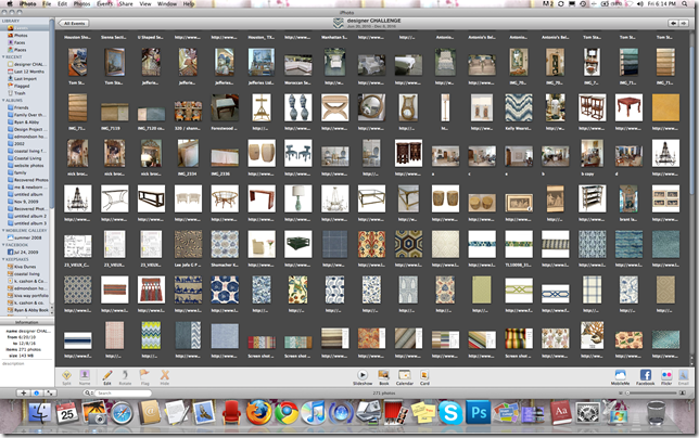
Once I pick out the main fabric (or in your case, the main 3 fabrics) I start having fun by playing around with different art/furniture/lighting options to see what looks good. Because I am not there to find out which of the three fabrics are your favourite, I decided to give you 3 different designs. In all three designs, I tried to make it where all the different art, lighting, rugs, furniture and accessories will work with any of the designs you choose. Hopefully you can take an object from one board and use it with the fabrics and furniture from another board and they will all work together.
On this design, labeled "Living Room 1", the Schumacher linen is the inspiration. This is where I think about just where I intend to use it. I think these would look great as curtains and would choose to use solid linens/cotton/blends on the furniture.
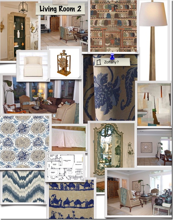
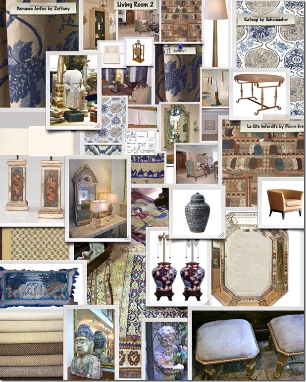
While playing around with thoughts on the "Living Room 2" board, I thought it would be great to add some gold/gilt to the room. When I see it next to each other on this board I consider it more seriously, because I think it looks good! Used either as a modern lamp OR as an antique mirror, they both work beautifully to me. Throwing a little modern art on this board looks good too. "Very sophisticated and Well traveled" is the feeling I get from this board.

I might work a little backwards by just now getting to the logistics of how the room will work, but I find that I have to be inspired and have a "vision" first in my head, and by going out and seeing what's out there -- art and furniture/antiques -- I usually come back with an idea of what to use and how to use it.
For this room, I feel a sectional would work wonderfully in the corner and give the room more seating. It seems like this room was almost made for it! But I need to look at the floorplan and the dimensions to confirm all my ideas before getting carried away with myself. This is where I get picky with the details considering the depth of the seating and the space for paths in the room. You really do have to know the exact measurements of a space, so no mistakes or "surprises" are made. Trust me, I know. I mis-measured by about 18" when we moved in our house, thinking FOR SURE our piano would fit. Yes, even that small amount makes a big difference, and needless to say, the piano had to go "bye-bye". *sigh.... This is one of those moments when your kids/students ask you (like you asked your teachers at the same age) "When am I eeevvvver going to use math in real life? I'll never have to use algebra or geometry in the real world!" Well kids, unless you want to waste a lot of money on a piano that won't fit in a house, trust me, you'll use your math when you get older.
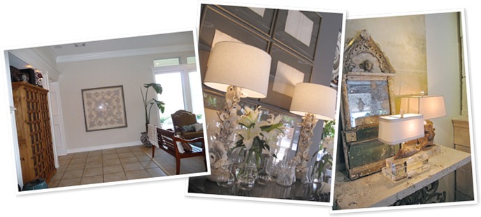
I am assuming your family has the television in the armoire, so I would keep it where it is. I love it! I would consider staining the wood a darker, richer walnut color like the similar piece shown here. And also, I would have a carpenter put the doors on a tracksystem so they can fold back completely into the recessed space. If you wanted it might be nice to paint the back of the cabinet in a complimentary colour to the room, for some contrast and interest so you could add extra shelves and display items in there also.
On top of the TV cabinet, I would group several blue & white chinese porcelain vases and ginger jars to fill up that gap and bring in more blue.
On this focal wall, which you see from the entry, I would put a console table and some lighting, preferably matching lamps with custom linen drum or rectangle shades. (Similar to the examples shown here from Lisa Luby Ryan in Dallas.) Over the console I would hang a mirror for reflection and to extend the space as you enter the house. Underneath the console I would have an upholstered ottoman on casters or an antique gilt stool covered in a yummy mohair.

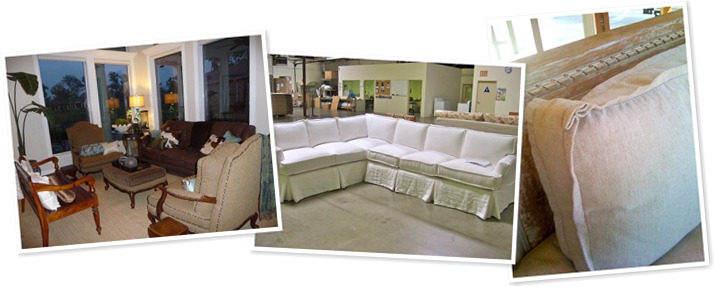
For the furniture in the living space, I would do a linen slip-covered sectional in a neutral colour. Slipcovers are GREAT for kids. It's so easy to rip them right off when a chocolate millk disaster happens and throw them in the washing machine. I had a client recently who was reluctant about putting light coloured slipcovers on her kitchen chairs. I cut a sample of the fabric, which was very, very light, and told her to do this: take it and give it to your kids and have them use it as napkins with a spaghetti dinner, then treat it with a stain-lifter and throw it in the machine. She did just that, and ALSO took her make-up off with it, and said that they came out perfectly clean! I'm not going to lie, you have to treat it and let it soak, but that is a great test to do if you are hesitant about any fabric. Also pre-wash your linen/cotton before you slipcover anything, to allow for shrinkage, or it won't fit after you sew it.
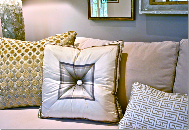
On the sofa, I would do a flat-flange in either a matching linen or a soft contrasting colour, similar to the examples from Quatrine shown below. I would bring in my coordinating colours in the pillows on the sectional. On either end of the sectional, I would place a small end table with two table lamps. But another option would be to forgo table lamps and use floor lamps for height.
For a cocktail table, I think a square shape would work best for the sectional, as it would give some room to add an upholstered arm chair to the space too. I think a modern OR a rustic style table would look great with any of the designs we picked!
As far as the lounge chair goes, I would put that chair on a swivel base so the person sitting there has the option to watch tv from a better angle.
Across from the sectional, and basically directly across from the tv cabinet, I would put a backless bench so the seating area is now set as a square. And some one who sits on the bench can have the option of facing into the seating arrangement for conversation, or have their back to the seating and watch the television.
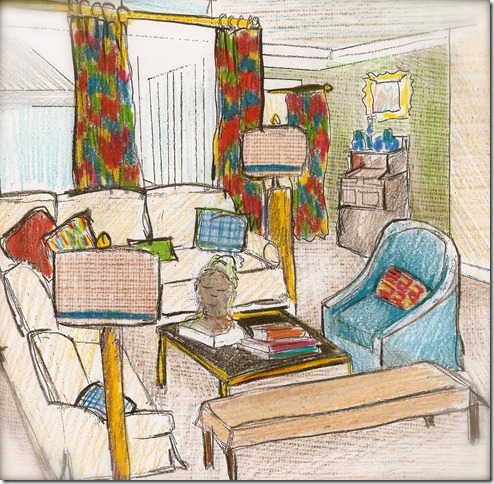
Directly in front of the fireplace, I would place two diminutive chairs, such as this tub or slipper chair, facing each other with a small garden seat/table in between them. I think it would give some special notice to the fireplace, and I think that it would make the room seem more cohesive... especially with the floor covered in wall-to-wall sisal. I think you said you had already done this here once before, and I like the idea still!
For the fireplace, I would place a guard that was made of frameless glass. Maybe this comes out after the baby is past the baby-proofing stage? But I think it would make the fireplace box clean-looking and open up that part of the room a bit.
On top of the mantel, I love how you have your art leaning, instead of hung. I do the same thing, and I would find a piece, whether traditional or contemporary/modern that has some colour or graphic quality that mimics the style/colours of the room's design. Or compliments it.
For the finishing touches, I would cover the entire living area in a custom sized natural fiber/sisal rug. You could do wall-to wall and take it from room to room, or you could do a rug that leaves about 15" of space around the entire perimeter.
I have a favorite that I like to use called Mozambique, but any weave that has a big pattern instead of a small loop/weave works best in high-traffic areas. Smaller boucles are hard to clean, especially where food may fall. I've had great luck with Tanzania also, shown here. Stains are almost invisible on it. And it makes a great, smooth tricycle platform!
I would center a hanging light fixture over the living area, directly over the cocktail table.
For additional decorative touches, I would place an architectural element or a sculpture atop the console against the wall. I would fill in the blanks with art work on the walls, natural elements such as shells on display, and window treatments of course! And I think it would look fantastic to layer an antique mahal or caucasian rug on top of the sisal carpet, but only around the seating area.
So I compiled groups of furniture, priced from High (1st Dibs) to Low (Target) and I think that with all of the different furniture pieces I picked, you can truly mix and match and almost all of it will work with all three designs I planned for you.
And to give you an idea of how they all work together (feel free to enlarge each image, as there are so many gorgeous goodies on each board! The detail in the fabric textures and the art/sculptures are brilliant!), I shopped from the choices I saved in your file and laid out 3 more-detailed options for choices in art and accessories for each design. Have fun mixing and matching mis-matching and THANK YOU Catherine for asking me to participate in The Shiny Pebble Designer Challenge. It was such fun, and I am honored to be contributing my designs along with the other talented and fabulous designers you featured! I'm flattered to share such company and humbled that you included me.
~~~
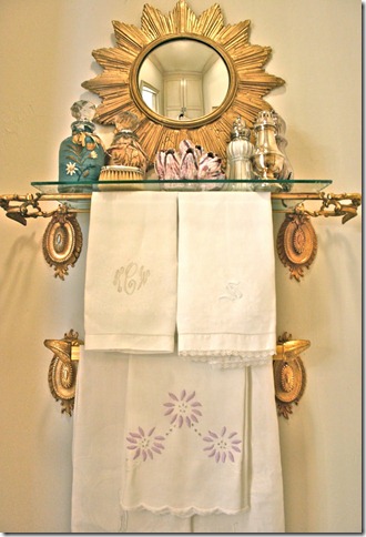
Now was this a fun trip or what?! I know you are just as excited about Kellie’s talent as I am and can’t get enough of her style. So here are a few of her best posts (not including this one of course!) over at her blog. The first time I visited her I fell right onto a towel bar shelf DYI, and I thought “oh no! that never has a happy ending”… and then I saw this:
Please, don’t forget to see what my dear friend Marsha at Splenderosa is up to…







![23_VIEUX_CARRE_-_FEDRICK_HARRIS_ESTATE_HOMES_FLOOR_PLAN[1] 23_VIEUX_CARRE_-_FEDRICK_HARRIS_ESTATE_HOMES_FLOOR_PLAN[1]](https://blogger.googleusercontent.com/img/b/R29vZ2xl/AVvXsEgR2KdNkdHmLnRpq1T_EPXW_BhZSmr4EpSxwMR1iULZKDscI8ZaOeRhjKBZKmUotr4ILw4e0JBzWJbBDEvA7ZGEpEJGZylT0k4gMS0aiDxxGUShZy1Sfrl5NrVF0jhFvQyh2woLvpEGQw6S/?imgmax=800)





39 comments:
Catherine, I am just totally blown away by the design work Kellie has created! It is all so beautiful and the thought process, wow!
I will go visit Marsha and if that necklace is any indication, I am loving it!
OMG!! I am a big fan of Kellies talent and her sweet person as well. She is a real love with more talent in her little pink than most. This is amazing and it would be so hard to choose they are all beyond lovely and unusual and fun. Kellie really knows what she is doing and it shows in her boards but also in her process. This was an amazing post and I hope many get introduced to this wonderful person and talented lady, Kudos Miss Kellie, you know I love you girl, Kathysue
W-O-W, just WOW! I'm having to pick my jaw up off of the floor....alright, I'm back. There is no question you would pick amazing talent, but it was an awesome insight to her specifics, detail and why she's successful. That is better than any article I've read in a design publication in recent history. And how fun for you!!
She is talented truly but what totally amazed me here is your promotion-writing-presentation talent. This is the first time I visit your blog. I was intrigued by the name, as I love love love pebbles and making mosaics with pebbles. I am definitely not disappointed by what I saw here, I can only congratulate you on your creative work!x
Catherine, I did exactly what you told us to do: get a refill and get cozy. Actually, I put on a fresh pot, checked my email while it was brewing, then came back with a fresh hot cup in hand and got cozy :)
First of all, let me say Kellie sounds like a fantastic girl. What a breathe of fresh air! I really enjoyed the intro. This girl has done it all... I am also one of those people who has tried a hundred different professions before finding something I truly enjoy and making it into a career.
I luv how Kellie describes "Continental Eclectic Chic", it totally made me giggle :)
I thought at a glance I would be drawn to the first style palette looking at the fabrics, but as the interview went on, I found myself in love with the second style palette instead!
And now I need a refill... :)
Wishing both of you lovely girls a lovely day!
Kellie is multi-faceted and multi-talented to say the least. I've been following her from early on and her talents never cease to amaze me. She would be a dream to work with for anyone. You made a fabulous decision when you asked her to be a part of your design challenge! Now what are you going to do?
Absolutely gorgeous and so inspiring! I am always blown away by the depth and breadth of your design knowledge.
And I know my husband would appreciate it if you would stop exposing me to items from 1st Dibs! :) LOVE that red lacquer piece.
I am in love with her style. Kellie sure has given me a lot of info to digest. At first glance I am in love with her second pallete, but I will need to spend hours pouring over these fabulous collections. I am sure to crack her code for luxurious casuality. Isn't she amazing?!
All of Kellie's work here is lovely. She really put a ton of thought into the area and it shows.
I am very impressed! Now, which one would you choose, Catherine?
xx's Marsha
I follow Kellie's blog but had no idea of her talented past, photography, etching, etc etc. I suppose it shows in her amazing work. This is a post I'm going to mark and study. Really enjoyed it.
Most interesting post of the day. I thoroughly enjoyed all the eye candy and am in awe of such talent. Very inspiring!
I've come back to re-look so I can absorb all of it. Kellie really put worlds of time, talent & work into this room, Catherine. Once again I love it. Marsha
This was an amazing post - so full of information and wonderful pieces and accessories...I just love it!!
XOXO
Kiki
Kellie is so amazing! I am such a fan of her blog and everything that she does. Her great sense of style is evident here with all of these really beautiful choices she has laid out for you! Loved reading more about her background and overall design influences, great post!
Oh My, I am so impressed with this post, the time and effort that she has put into everything-- all stunning, Bravo!
This post is an excellent example on the amount of work involved in the design process. People should be aware that great designers don't just 'wing' it. There is a ton of preparation and hard work behind the talent. In a real life experience, the amount of work may even double or triple. measurements, meetings with the client and artisans, installation time and countless hours on the phone making sure that everyone is in the same page and that all of the minute decisions have been made are a few more examples of where your money goes when you hire a great designer. They are worth every penny, as you can see!
Holy moly, Catherine! You are getting some wonderful (and free!) design advice! Love all of these options but I gotta say #2 is my favorite (probably all the blue and white, yes? but I also love the mix of patterns).
W.O.W. I'm amazed at all the detail...just incredible!!!
LR3 for me please!!!
xoxo
So much wonderful eye candy and inspiration. I love it all. I've spend several minutes just drooling over every pic. Fantastic post. Thanks, I have really enjoyed this. Hugs, Marty
I adore Kellie, her aesthetic and what she came up with for you!!! She is an enormous talent and I am thrilled to see how she went about this project. Inspirational and educational. Beyond amazing post, Catherine!!!
I just want to say a quick thank you for all these incredibly touching comments, from blogging friends and blogging strangers but "hope to be friends with one day".... I am so humbled by such kind words, and It really means a lot to me. It was such fun to do this, especially for Catherine who is such a warm and genuine person, but I would be remiss if I didn't tell ya'll (or "you guys" for you yankees *wink) thank you also -- for putting the "swing in my step" today with the "applause". Timing's very funny, because I really needed it! Okay.... I'm off the mike... xoxox
k
(is "swing in my step" a real saying? Today I told someone I was going to "throw a monkey in their wrench".... I"m so bad with those sayings... it's a "monkey wrench" and "throw a wrench in plans" ?? who knows. hopefully "swing in my step" isn't too far off, but you get the gist. :)
Holy Story Board Batman! I need about a half hour to look through all of this. Very talented and so much time and effort was put into this and it shows. I can't wait to look through her blog and will be adding her to my blog roll. Nicely done.
All I could say this morning was Wow!
All I can say now is Wow!
I hadn't set aside enough time this morning to digest Kellie's fabulous post, so I just returned this evening after the hubbie went to bed to finish. It is so true- Kellie's post is a great example of the true amount of time it takes to come up with "the plan."
So, Catherine, which are you leaning toward? :)
XX, Ann
A wonderful post!
Donna
This is a great example of what talent, skill and creativity can produce when put to the task. Kellie, you taken every one through a real design process, and as always, your details have taken a basic plan to a new level. Very well done. Don't you wish you could actually do it !
WOW, this is one talented lady! I love her sense of style. One of the most difficult things about design is the sketching and drafting involved. It was one thing I struggled with in my Interior Design classes. I was just amazed at how beautiful and detailed her sketches are, and using crayons! Brilliant! Great post!
PS, Thank you for adding me to your blog list. I have added you to mine as well. :)
Wow, what rock have I been under to just now be discovering Kellie's blog? I just read a tad of hers and plan to check out more after Maddie is down to bed tonight! And, she's in Dallas....
She has really given you some fabulous options....this series was brilliant....your home will look amazing with all of these awesome suggestions!
wow.... this is a great post.
What a great post! I'm coming back later to go over more details, this is such an extensive interview. Thanks so much!
Thanks, too for joining us for FrenchGardenHouse's Romantic Ruffled Linen GIVEAWAY ~Lidy
Cheryllynn Emmer said: " This girl is amazing. And took SOOO much time with all her ideas. I groove with her opinion about NOT having perfection. I've become more proud of my frayed love seat now 30 yrs. old and still comfortable, colors now muted from fading. I'm still not tired of the trees in the fabric. You GO Girls!"
How come I did not know about this girl!!? Feel like I have been living under a rock..! She's great and OMG the energy and effort she has put into this!
Loving 'living room 2' - think the blues would look great as a backdrop for gorgeous you.
Off to see more of her blog now.
x Charlotta
Hey Kellie! Me and you are definately peas in a pod. I have #11 console in my entry and the Lee Jofa Fretwork pattern is wrapped on some acrylic frame benches - the same color too...! You are so super thorough! Great post! Alana
Oh I'd hire Ms. Kellie Cashon in a heart beat! I like that the drawings are included - helps me visualize the whole. Good Job!
Wow, so much to enjoy here! What a feast for the senses. I love the concept of starting from fabric... and it's great to see such a range of prices in her selections.
love the way she took use through her entire design process-beautiful work!
Mamma Mia what an amazing girl!
Not only talented, dedicated, committed, and passionate, but also sincere, friendly, warm and fun.
I love her already and am so glad you introduced her to us. How I could have missed her is beyond me!!
She had me at 'what defines your style' and I found myself agreeing to everything she said.
The amount of work that has gone into this is amazing, and I am really touched that she treated this as a real life project, and that she took the time to educate us on the process.
Such a great post Kellie! Thank you!
Hugs & Kisses
xx C
Kellie put her heart & soul into her designs and this post. Truly magnificent. I can't embellish on it any more than that..'magnificent'.
Thank you Kellie & Catherine!
Nice work Kelly'
Russell F Cashon
Nice work Kellie, with those creative abilities you must be a relative.
Russell F Cashon
Post a Comment