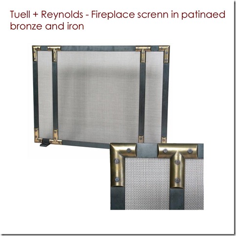
Please help me welcome to the Living Room Edition of the Designer Challenge, Elie Fournier. This powerhouse is quite the entrepreneur. She is the force behind Punctuation Mark (a blog), Fournier Papel (a stationary collection designed by her), Vanille (a patisserie business of sorts) and the label Elie Fournier (accessories line designed by her). Last year, Elie’s stationary made it to the Secret Room Events 2009 Academy Awards Red Carpet Style Lounge gift bags.

Background:
I am a licensed interior designer (in the state of Florida you cannot call yourself an interior designer if
you don’t have a license) and have practiced commercial design for about 8 years mostly hospitality and
some corporate because I like the environment in which these types of projects happen. I’ve been very
lucky to say that I’ve worked with some of the most influential designers in the world on boutique hotel
projects and some of the largest hotel companies. Additionally, I am a LEED Accredited Professional
which has helped in the way I design because the products that we put out there have an impact both
on our planet and on the people that get to live in them.
How do you define your Style?
My personal style is simple and light. My home has large windows all over and the whole layout centers
around letting it coming into the house and being able to see outside.
At work my style is the style of my clients and all I do is translate their style into a tridimensional space. I
have worked on traditional projects in which I have given the clients the possibility to adapt their space
to different situations and to change it easily or if their personal style changes. The modern project I’ve
been involved with had the characteristic of looking that they don’t feel cold allowing the people living
in them to always feel comfortable.
What designer or life experience has influenced your design aesthetics?
I am heavily influenced by the local environment of where a project is located. When I work on a project
I like to talk to the people who will be working there and take a good look at what city or place it will be.
The reason for this is that this project will create an impact on the local community and it is up to the
designer to make a positive or negative impact.
What are your go to resources?
I have sooooo many that I don’t think there is enough space here to name them all. I do have to say that
I usually start the process with images of anything that is related to the project… cities, flowers, art
work, maps, city grids, fashion, etc… so I guess one of my first sources would be Flickr.
As in material resources they are a collection of manufacturers that I have worked with time and time
again throughout my career that usually deliver good product value at the right budget so the client is
always happy.
What are your thoughts of my room?
My idea for this space is to open it up and create groups of seating that can be changed depending on
the occasion without altering the total look of the space.
the occasion without altering the total look of the space.

The colors used are neutral but also have a touch of elegance in them. Leather is the material of choice
for the sofa because it is the largest piece of furniture in the space that ties it all together using one of
the fabrics used in the other pieces as accent cushions. Also, it is used for the ottomans that can be used
as side tables and seating.


The fabrics have dynamic prints with dark backgrounds and accents in blue and tan picking up the colors
from the area rug and the leather. The chairs that are upholstered with these fabrics are smaller in scale
and allow free flow in and out of the living room area. Additionally they create small intimate spaces
within the larger space itself making conversations amongst people easier.

The area rug is made with wool and silk to give it both body and luster taking advantage of the stripe
patterned in which it is woven.

The furniture selection is contemporary with a retro influence so each piece can blend with each other
but also stand on its own. The lines of the furniture are soft and have unique accents like the lounge
chairs that have a back with a wood piece carved in a sort of wave bringing added comfort to whoever
sits on them. The same can be said about the side chairs that feature a rounded back and low arms
enhancing the comfort level of the chair.

The niche next to the fireplace will be filled with a bar/credenza type of piece that will serve as
additional storage or as a bar to fix drinks to the people seating at the living room. Above this piece will
be a mirror that will make the space look bigger but will mainly reflect the outdoors and the
environment from the windows facing the covered patio.
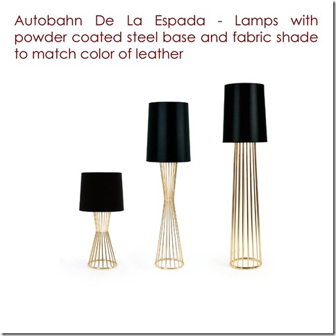
The wicker lamps will add warmth and texture to the space but also have a color similar to all the colors used on the other materials.
The artwork above the fireplace will be more modern to add dynamism to the space.

Finally, barstools placed on the bar area connected to the kitchen allow the space to become part of the
dining and kitchen area but also serve as sculptural pieces because of their unique construction and use
of materials.

~~~
Thank you Elie so much for contributing to this series. I am particular impressed by two ideas: the mirror reflecting the outside and the bar!!!! Fantastic.
Thanks to all my readers for stopping by today. If you would like to view the other entries in the challenge, including the Dining Room designs, please click on the names of the designers at the top right corner of this page under the Designer Challenge buttons. You will be taken directly to that designer’s post. Below I have also included the designs done so far for your convenience:
Designer Challenge – Living Room
Kellie Cashon’s (Cashon & Co.) Continental Eclectic Chic
Designer Challenge – Dining Room
Raina Cox's (If The Lampshade Fits) Boho Contempo Style
Christina Fluegge’s (Greige) Transitional Eclectic Mix
Beth Connolly’s (Chinoiserie Chic) British Colonial Style
Amy Forshew’s (Pemberley Style) Soft Tones Traditional
Charlotta Ward’s (Space for Inspiration) Elegant Nordic Conceptualizations
Leigha Oak’s (Elle Oh ) The Belgian Look with a Twist
Kellie Collis (Ada and Darcy) An Aussie’s Interpretation
Gwen Driscoll (Ragland Hill Social) Dramatic Glamour
Hurry over to Splenderosa to see what a fun post and gorgeous outfit she has picked up for this room!


12 comments:
I can just see Elie's presentation photographed for Elle Decor! The lines are sleek, but her fabric choices are also practical.
Beautiful!
I love the streamlined design. I especially love that rug....I am a huge fan of silk in rugs if the budget allows and it is practical for the space. Love this series.
Elie has incorporated so many looks that I either already have in my home, or would like to eventually have in my home. This is fantastic, and very attainable.
Wishing both of you lovely girls a lovely day!
thank you soooo much for letting me participate and happy you liked it... have a fantastic day!!!
Very sleek indeed, I just love it.
These are all pretty cool... great design concepts!!
XOXO
Kiki
Hi to you both! (I am awfully summer blog lazy, but I always love coming for the design challenge/inspiration!)
I love the cognac leather colors and Holly Hunt's rug.
And how refreshing to see some Swedish illustrators on the wall! (Would like to know who they are!).
Summer hugs,
Mon
Elie has a great eye and I love her idea of opening up the space with different conversation areas - which can be reconfigured depending on your needs. xo Elizabeth
WOW, Wonderful, I love the lamps.
It's a very "down to earth" yet classy approach. Love it all. And FYI, that Edelman-Distressed Leather wears wonderfully. It just keeps getting better with age and always looks great :)
Wow...love the choices here. The overall neutral color scheme is so relaxing..and now officially obsessed with those amazing lamps! Great job!
Fabulous Elie. I adore the fabric choices, furniture and especially taken with the fireplace screen. Truly created a great living space.
Bravo!!
Post a Comment