Help me welcome to The Shiny Pebble Designer Challenge Living Room Edition, the super handsome and stylish Will, from Bright Bazaar. I first ran into the blog of this English vibrant writer a few weeks back while he was reviewing one of the bazillion shelter magazines he covers. What a treat, let me tell ya. The energy of his blog keeps me coming back asking for more. I am so happy to present a guy’s vision for my room. Enjoy!
~~~
My background
Well, to start with, I certainly can't take credit for being a real life proper designer! I'm a young guy in my twenties who has a serious love of good, colourful design. I studied Journalism at university and have since been working in the corporate world in the UK, but let my creativity surface in a number of ways...Firstly, I write a daily blog on all things colourful in the world of interiors, and then I write freelance on interiors on an ad hoc basis. I'm an advocate of making rooms fun, personal and unique - often through colour (and bright hues at that!). I have met so many wonderfully creative, talented and inspiring people through blogging and I'm delighted to have the opportunity to be here creating a fictional space for Catherine's living room!
How do you define style?
Style for me is all about letting go. I guess that's why Jonathan Adler is my favourite designer; I like how his creations and interior schemes are fun, relaxed, tongue-in-cheek, but all the while ever-so stylish. That said, I don't think style can be defined, well not to me personally, because each and every day I see new spaces that inspire me and scream style!
What inspires you?
I am inspired by shelter magazines, stationary designs, fashion, patterns, fresh flowers, the colours of the sea and sky, photography and music.
What life experience has shaped your design aesthetics?
This has to be when I was a child; I had a bright yellow cover for my bed and I remember how happy it used to make me - especially seeing it when we returned from family holidays. Given I was always rearranging the furniture in my bedroom, I think it was a dead cert that I was going to love design. Once I left home and went to uni, this was when I finally fell in love with this great world of creativity.
What is your go to source?
It has to be Etsy, especially for the beautiful photography and prints that some of the sellers stock. I love vintage, colour enhanced images - their warmth and uplifting nature always appeals to me.
What were your thoughts for my room?

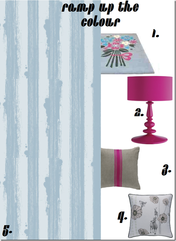
Catherine explained that her favourite colour was blue so I knew that I wanted to incorporate some blue hues in the scheme. The starting point for the room was the bouquet rug, which featured the fab blue and pink colour combo, which I felt was perfect for the living room. From here, I added bright pops of pink in form of a high gloss table lamp, which I echoed in the striped cushion, with simple grey hues to ground the scheme. I echoed these softer, grey hues in the second throw cushion and chose it for the delicate illustration it held. This was to ensure their was visual interest in the room beyond the bright colours. I think the wallpaper would look great on two of the four walls - I like the causal nature of the blue stripes, with the splashes of paint, it creates a laid back and unique look, which is perfect for a living room.

I chose a simple grey sofa to tie the blue and pink colours together. Plus, it also acts as a base through which to add pattern - namely in the form of some fun, graphic cushions and throws. I chose graphic patterns to add a touch of masculinity and balance out the poppy pinks. The vibrant coffee table has a detachable tray, which I thought would be practical for guests and when Catherine's little one wanted to play on the floor! Plus, the lacquer nature of the piece ties in with the high gloss pink table lamp. Graphic notes are continued with the angular mirror and 50's style clock, whilst the deeper blue hues from the 'links' cushion are drawn out in the side table. To finish things off I felt two of the chandelier pendants would look fantastic hanging side-by-side in the middle of the room - their subtle pops of different colours add interest and prevent the room from looking too set.
~~~
I think that coming home to a pair of those fabulous chandeliers would evoke the same feeling of happiness that Will described about his Yellow bed covers. I hope you all enjoyed seeing my room thru the brilliant eyes of a shelter magazine addict. I was also glad to see stripes being used, Will’s signature pattern. He did a fabulous job carefully selecting just the right print and scale with the perfect balance of color throughout the room. Very youthful, very energetic, very Will.
Thanks to all my readers for stopping by today. If you would like to view the other entries in the challenge, including the Dining Room designs, please click on the names of the designers at the top right corner of this page under the Designer Challenge buttons. You will be taken directly to that designer’s post. Below I have also included the designs done so far for your convenience:
Designer Challenge – Living Room
Kellie Cashon’s (Cashon & Co.) Continental Eclectic Chic
Elie Fournier (Punctuation Mark) Elegant Flexibility
Designer Challenge – Dining Room
Raina Cox's (If The Lampshade Fits) Boho Contempo Style
Christina Fluegge’s (Greige) Transitional Eclectic Mix
Beth Connolly’s (Chinoiserie Chic) British Colonial Style
Amy Forshew’s (Pemberley Style) Soft Tones Traditional
Charlotta Ward’s (Space for Inspiration) Elegant Nordic Conceptualizations
Leigha Oak’s (Elle Oh ) The Belgian Look with a Twist
Kellie Collis (Ada and Darcy) An Aussie’s Interpretation
Gwen Driscoll (Ragland Hill Social) Dramatic Glamour
Hurry over to Splenderosa to see what a fun post and gorgeous outfit she has picked up for this room!


24 comments:
I really love what he did using just a pop of pink in a few places. The rooms looks warm & inviting without being frumpy. You will look beautiful when you entertain there. Congrats to Will, he did a great job! xx's
hello catherine! I like will's color choices-blue, gray, pink. I will be visiting his blog. You have been mentioned on my blog, come over when you have the chance. have a lovely day! verbena cottage
With Jonathan Adler as a favorite designer, how could Will go wrong! Love the turquoise coffee table and painted striped wallpaper - so fresh and chic!
Catherine! I'm so glad to be home for a few days and trying to catch up. What a fun look! I think my favorite piece is the chandelier. Off to check out what I've missed
xoxo Pattie
I am a color person as well, no neutrals, except my walls which have to be that way, because they curve. I'm less graphic in color selection than Jonathan Adler, although I appreciate the fun of it. Every one has been posting white lately, so thanks for your colorful addition!
Well done Wil!
Love the unexpected colour combination and the grey sofa. Those chandeliers would make me happy too!
Will, I'm so toward admiring you and considering your aesthetic an example for myself to follow! Loved the post and you should definitely focus on your career as an interior designer!
Thank you so much for letting me take part in this fun series, Catherine, I had a blast putting together this scheme for you!
Also, thanks for the lovely comments from your readers - I'm very touched. xo
great post, Will has great taste and his blog is always a pleasure to read! Love all the colors
Will is a treasure. I really like what he's envisioned here--especially the striped wallpaper and the clock.
So great to get to know Will a little better. Thanks Catherine for having him.
So nice to see a man on the blogging scene, and with such great taste, just love the pink accents.
MOTH will be very heartened to read Will's guest post Catherine. When I suggested he might like to be a Guest Designer at The Shiny Pebble, he said he didn't want to be the first bloke. Now he doesn't have an excuse - prepare yourself for a VERY interesting take on your Living Room. He's flipping through the junk mail from the Hardware Store looking for ideas as I write this!
Millie ^_^
Blue and pinks...between those colors there isn't a hue out there that someone couldn't identify with and love. So for that, it's not just beautiful, it's brilliant. The lighter blue w/ gray is a good choice, b/c it does lend itself to being versatile and friendly with many other colors as well. How fun, and how fun for you Catherine! I visited Will's blog and loved it :)
He certainly is CUTE! Great choices and color palate. I am hopping to his blog now....
Very fun and cheerful inspirations! Plus he's a total cutie, lol!
Happy weekend, sweetie :)
what a neat blog!! I love your blogroll - lots of inspiration!
What a fun room he describes! I'm intrigued with the wallpaper. And I like the color palette.
Well here's a man who lives up to his blog title! What a fun and great design concept. Like a breath of fresh air.
Hopped over to his blog immediately after reading this and became a follower.
Great post. Lovely lovey.
x Charlotta
Oh I just love his style! It's quirky, fun, and colorful! Who knew that with one little dining room redo you would develop such an incredible series! It has turned out great! So glad I could be a part of it,
xo
amanda
Hard to be grumpy in any of Will's rooms! Good for the eye and for the soul.
He is very creative and so friendly! Adler will hire him next!
ox, Mom
P.s And how is Ms. Catherine doing? Summer is great I hope. I am (almost) on my way to Stockholm. Really excited!
How fresh! Items 2 & 3 are just screaming my name. Great job Will!
He pulled that room together beautifully! Looks like a bright, chic, cheery place to rest. :)
Will is the greatest, isn't he?
Bravo to Will. I cheer for his happy color palate and his fun approach. Design should be fun if you are a fun, lively person. I just happened to come across his blog yesterday & looking forward to reading.
Great challenge and thank you to Will and Catherine. Wishing you both a great new week. x
Post a Comment