Let us welcome this week to the
Designer Challenge, Gwen Driscoll from
Ragland Hill Social. Gwen is a fantastic designer whose work is admired and respected by the interior design enthusiasts in the blogosphere. Her business, Gwen Driscoll Designs, is a full service design firm located in Memphis, TN, specializing in residential, contract and hospitality projects nationally. If you are not familiar with her work, please visit this
home , one of her latest projects and this fantastic
Sophisticate of the South piece. You are sure to be smitten by this designer’s unique talent.
~~~
Tell us a little bit about your background?
I'm a Southerner through and through. I split my time growing up in Bowling Green, KY (a small town one hour north of Nashville) and Memphis, TN. I had the advantage of living in a city and a rural environment. My family has always owned a beautiful farm in Kentucky and we spent lots of time there as children. My time in Memphis allowed me to interact with sophisticated environments and people. I'm a woman who is comfortable with people of all walks of life. I can be equally inspired by a highly educated, sophisticate or a farmer who loves the land. I believe all people who are good and wholesome can teach me something always. I'm not afraid to ask any question, regardless of how elementary it may seem. I love my cowboy boots as much as my Jimmy Choo's!
I do not have a formal education in design, my degree is in English Literature. I believe a liberal arts education is the absolute best a person can have. You can always hone your skills in a certain field later in life but learning about many, many subjects in college, I believe, is the best base for a well-rounded person. I wouldn't trade it for the world. It's made me thirsty for knowledge in so many different fields, I'm constantly in search of educating myself with something new and interesting. My mother was a teacher for 30 years and both my fathers have the patience of Job, leaving a child open to explore lots and lots of subjects. We were always encouraged to ask questions. I was told many times, "It's the only way to learn. Speak up!"
I also believe I was given a gift from the heavens above. I can see a space instantly as it should be (in my opinion, of course). When starting out in this business I took it for granted, not realizing others didn't have the same ability, even other designers. I now drop to my knees daily and, with humility, give thanks. It's been a major key to my success.
I love family and friends (I consider clients both). They are the main emphasis in my life. Without all these special people I interact with daily I wouldn't be me. They are part of my daily tapestry and make me who I am, past and present.
 How do you define your style?
I don't consider my design as a style but more a set of guiding principles that I use in every project I work on.
Guiding Principles
Architecture I always respect the architecture of a space I'm working on. This architecture never dictates or limits my design plan but is a place I start with every project.
Client Input
I spend lots of time with my clients initially to determine what their desires and dreams are for the project. I consider designing a space a collaborative effort with my clients and me. It's important to know how the space will be used, how it should look and feel and then I like to know why a client chose me to work on their project. If they have seen a space I've designed and concepted it's helpful to know that. It gives me direction. Most spaces I design are unique to the client I'm designing for but I use a lot of the same concepts in my work so knowing what inspired them to hire me is important.
Research & Development
I spend a great deal of time researching products and finding new and innovative things to do in every project I work on. I think this is what keeps my design fresh and exciting. I do use a lot of the same sources again and again but never the same items from a source.
Products & Artisans
I couldn't do my job without the beautiful things I use to create wonderful spaces for clients but, most importantly, my team of artisans that make my design a reality are a huge part of my style and process. I always focus on what the best design is for a space and then pull together my talented team to make it happen. I've worked with many of the artisans for more than a decade so we speak the same language and know each others strengths and weaknesses.
Respect Tradition & Quality I love the tradition of design, antiques and unique items that are found in my travels and research. I'm always looking for objects and special pieces for each space I design. I believe a huge part of my job is to educate and assist clients in starting collections they can cherish forever whether it's antiques, art, lighting or quirky things that make a space exciting.
Quality is of utmost important to any design. To me, quality doesn't equate to expensive. It can be a piece of art from an artist just starting out who has immense talent. I think a strong designer is able to spot quality a mile away and, quite frankly, that is what you are paying a designer to do: steward your money to best of his/her ability. Having a designer involved in your project will elevate the budget a bit, but your money will be spent in a more diligent, educated way. It's smart to bring in someone who does this every day (and night) in my case. How in the world could a lay person keep up with the current design world? There are so many options, products, opportunities. A designer can narrow it down and focus your process instantly.
Process
Many times clients come to me and don't fully understand the importance of the process of designing a space. As good as I am, the longer I work for a client or work on a project the better my design gets for that client and respective project. I think about what I do as a profession constantly, so a fabulous idea may only occur to me after we've had time together and I've had time to live with the project. Rushing the process is an absolute NO NO. You must have patience and enjoy the process to really get the best product in the end.
Element of Surprise
I like spaces that are alive and exciting. This doesn't mean that every tabletop or inch of wall should be covered but it does mean that every space should have something that is unexpected and different.
Restraint A space must have order and a common language to be fabulous. My spaces are layered and interesting but that doesn't mean things just land and aren't properly planned for. My design may appear that way and I hope it does but everything, and I mean everything, has a purpose and is part of the plan. I'm certainly not saying a client shouldn't purchase an item without my approval but I am saying I deserve to have input in a space that I've concepted and decide where to place each item.
What inspires you? Everything!
Which designer or life experience have shaped your design aesthetics? I really think growing up in a home where I was allowed to express myself let me grow as a creative being. My parents (I have three: my Mother & Step-father & my Dad) all appreciated and allowed me to be me. I was encouraged to explore my artistic talents my whole life. My first love was clothes. I was always experimenting as a child and teenager with different compilations of clothing, jewelry, shoes, etc. I did receive "Best Dressed" of my high school senior class. I'm not sure I deserved it, but "Most Creatively Dressed" I did deserve.
I love all different types of design so my guide with other designers and their work is GREAT DESIGN. It doesn't matter if it's traditional, modern, eclectic, bohemian, etc. If it's well done it gets my attention. I have great respect for all that practice design of any kind.
What is your go to resource?
I have so many! I love Osborne & Little, Holly Hunt, Clarence House, Scalamandre, Schumacher, Kravet, Quadrille, C & C Milano, Niermann Weeks, Formations, Dessin Fournir, Gracie, Leontine Linens, West Elm, Z Gallerie, Target, Pottery Barn, Williams Sonoma Home, Crate & Barrel.
And, I love antiques and art. I have great relationships with so many dealers. I typically shop in Memphis, Atlanta, New York and New Orleans. I love 1st Dibs too. Some of my favorite dealers are: Karla Katz, Shane Robuck, Amy Perlin (so sad she is gone), Amanda Talley, David Lusk Art, Linda Ross Art, Vicente Wolf, South of Market, Jerry Pair Antiques, Travis & Co. Antiques and Frankum Antiques in Memphis.
What were your thoughts when designing my room?
I love Catherine. I've been reading her blog for many months now and it isn't hard to see what an interesting person she is. Though I haven't been in her space, personally, I think it can be a wonderful room for her family to enjoy, both formally and informally. In all my design, I'm interested in creating a mix of styles and price points. I'm always looking for something that will be the lead, in this case, the Gracie wallpaper, Julie Neill chandelier and Holly Hunt chairs. And then, everything else can be secondary. I hope everyone likes it. I LOVE IT!
THE DESIGN PLAN
I'm so excited Catherine asked me to be a part of the collaborative team giving design ideas for her Dining Room. First and foremost, when designing a project for someone, I create the absolute best option for a space, usually, starting as if it was an empty room.
Many times it's challenging for a client to get excited and inspired in a space when repurposing items. I usually propose doing projects in stages if the budget doesn't permit an entire overhaul. So, if the space is designed from scratch in the beginning, a client can see the vision clearly and we can decide what should happen in phase I, II and even III.
Catherine's Dining Room is a nice size room, not too large or small. I do think the room would be more important and dramatic if it was furnished more sparingly. So, move it all out (mentally) and envision a blank slate.
Because this room has multiple doorways and windows, I propose painting all the trim to include, base and crown molding, windows and door trim Benjamin Moore's Coastal Fog. It's a beautiful color that reads as a neutral but isn't dreary and dismal, it has some life to it. See this beautiful image board of Gracie wallpaper below. Let's wrap the walls with Gracie and let it sing openly.
I love a Dining Room to have drama and presence. It's typically a room that you aren't in every day, it's usually a room you celebrate holidays, special occasions, elaborate family dinners and we always have dinner in our Dining Room on report card day (at least so far it's been a celebration). Therefore, I like a Dining Room to have its own feel, emotion, a space that doesn't fall flat, a space to be remembered.
Gracie was founded in New York in 1898 and is still a family run business today. Isn't that amazing? Mr. Gracie had a friend, a textile trader, who showed him a roll of spectacular hand painted wallpapers he had discovered in Beijing. As any great entrepreneur would see, Mr. Gracie felt he had found his unique product for the design market. Decades later, Gracie Wallpaper is truly a beautiful product that, most anyone, would love to have in their home.

This is the Gracie paper I've chosen for Catherine. It's sophisticated without being stuffy, it's interesting without being too busy, it's perfection! Now, for those of you thinking, "Yeh, right, who can afford Gracie?", I have a solution. I would never contemplate copying Gracie exactly, that just wouldn't be professional or ethical. But, I would show a local artist in Catherine's area our Gracie inspiration board and ask him/her to create a dramatic original plan for us. Or, I have several artists I work with on a regular basis who have created masterpieces for my clients. Finding the right artist is key. This could go beautifully or could be a disaster. And, my eyes guide the entire process. That is really what a great designer does for a client, takes a concept and turns it into a reality seamlessly.

Here is my paint selection board for the Dining Room. Benjamin Moore's Coastal Fog will be the trim and molding color (as stated above & here above right), everything except the ceiling. I think Catherine's ceiling, actually, could be an interesting opportunity for this space. It calls for a fabulous chandelier & special treatment to create drama. I propose painting everything above the crown molding, Benjamin Moore's Texas Leather (see above left). If the budget permits, I would love to see Catherine mirror her entire ceiling in this room. So, we have two options for that. Which do you prefer?
And then, we will hang this beautiful Julie Neill Designs chandelier. Have you ever seen anything more simply gorgeous? My two favorite things in juxtaposition: simple and gorgeous.
Because our walls and ceiling are going to be spectacular and dramatic, I think the drapery should be simple. My favorite drapery always is a beautiful silk used in an informal way. I like to use crusty iron rods & rings for drapery, sewing the iron rings directly on the panels for a look that is casual and beautiful. The silk for this project is Schumacher's Bellini Silk in Mocha.
All of these elements stated above create the first layer for this room. A layered approach to design is what I believe makes my design unique and inspiring. It's what puts people at ease and lets them feel like they're home. How a room feels is as important as how a room looks and layers are what make it feel real and comfortable.
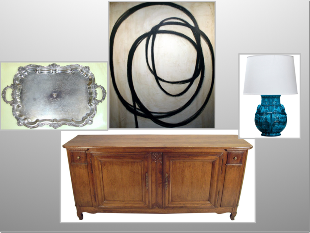
I've selected this beautiful Grand Louis XV buffet from Uptowner Antiques in New Orleans. I always love to use sterling silver in a Dining Room, something like this beautiful tray will sit on the left side of the buffet. The turquoise faience vase turned lamp will sit to the right of the buffet (it needs a new shade that isn't so starkly white). It's from H.M. Luther Antiques in New York. And, our element of surprise is this David Comstock painting from Linda Ross Gallery in Memphis. This painting is a graphic, modern element to balance our traditional pieces in the room.

If a Dining Room's size permits, I always like to create a comfortable seating area that can be used when entertaining for large groups or you can sit and enjoy your morning cup of coffee, so it doubles as a Morning Room. I love this banquette, modern pole lamp and a pair of these ceramic garden stools to sit in front of the banquette. And, everyone knows of my unusual interest in antlers...I love this mirror from Mecox Gardens to hang above the banquette. This will all go on the wall where the China cabinet originally was placed. It can be centered or banked in the corner by the window.

A Dining Room table can be a huge investment. I haven't purchased a "real" table for my own Dining Room because, at age 40, I can't yet decide what style I want to commit to for a lifetime. I have a table similar to this one from Z Gallerie in my Dining Room and I love it. It's beautiful for buffet serving for a large party with its strong architectural and modern feel or looks great with chairs around it for a dinner party.
For Catherine, I've chosen these fabulous Holly Hunt chairs to be upholstered in Edelman Leather's Luxe Calf in Rootbeer. A very chic way to finish her Dining Room project.
I also love to use beautiful tablecloths, napkins, placemats, found sterling silver and fabulously simply china that lets a beautiful meal be the show. I think Catherine's table would be perfect for white or lavender hues in flowers. And I love horn anything: bowls, drinking horns, silverware with horn handles. I think this could also be a great addition to her Dining Room table.
My go to source for beautiful heirloom linens is Leontine Linens. See these beauties below.
Everything about Leontine Linens is custom. They have thousands of combinations of monogram styles, colors, borders, fabric types for you to create your special heirloom. And, best quality of all, wash and dry at home to perfection.
The founders of Leontine Linens, Jane Scott & Philip Hodges, are great friends and clients. As a thank you gift for decorating their beautiful home, I received a set of 12 placemats and napkins for my Dining Room. I wept because they are truly exquisite and something I will leave to my precious Lucy one day.
I hope this design scheme is something Catherine likes and you all have enjoyed having a bird's eye view into my design process. I'm passionate about what I do, love it dearly and I'm energized daily with the lovely people and places I encounter because of my profession. And many of those are my blog friends, who now, have become a part of my daily tapestry. Much love to you all.
Gwen
~~~
Wow, if I didn’t love Gwen before, I would have fallen in love with her all over again. Her design philosophy as well as Gwen’s captivating persona truly shine through in her design work and writings. Sophistication personified! It did not go unnoticed the little touch of lavender in the flowers, Gwen’s design signature. And oh my goodness, I have been eyeing that Julie Neill chandelier since I first saw it in her blog,
Bayou Contessa, right after moving into my new home. I think this post might just have closed the deal on that transaction!
Now, please go visit the fabulous Splenderosa to find out what she has selected for this week’s soiree.
If you all enjoyed this makeover as much as I did and would love to see more entries and related posts, please check out the links below:
Next Wednesday, come back for the very stylish link party we are throwing to celebrate the finale… More details on this Friday’s post.
Once again, thank you
The Daily Basics for helping us spread the word of the challenge.
Hugs and Kisses!
Catherine
Linking to: Trendy Treehouse , A Stroll Thru Life, Tablescape Thursday, Transformation Thursday, Show and Tell Friday, Remodelaholic, Metamorphosis Monday





![Catherine's dining room[1] (2) Catherine's dining room[1] (2)](https://blogger.googleusercontent.com/img/b/R29vZ2xl/AVvXsEjtlEh38fq1XsJnDtX8mQK5wBvcKI95tLKpm0aUpO8zO_OkGooefoIj6KQ6zjmULLRIjzu1-mwjJHY9x5nRBhlyocQy91eGZ4oJuFoyj0t5Ok9Ss-tPJXCRBm2KJCIacJxt-c64C7eG7PXX/?imgmax=800)


